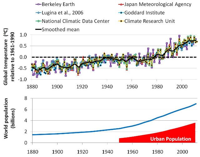
The globe has warmed 0.1 degree, the Connolly's are showing you how the science is done by the agencies responsible for rise in global temperature's when in charted form, reality is the globe is 0.1 degree warmer now than 100yrs ago.
So we will move on then jimi, unless you can connect the greenland ice caps to the Connolly's station data papers, i take it you have no grievance with their introduction.
So we move on.
2. What is the urban heat island problem?
Even in the early 19th century, it was already noticed that city temperatures were artificially warmer than the surrounding countryside:
…the temperature of the city is not to be considered as that of the climate; it partakes too much of an artificial warmth, induced by its structure, by a crowded population, and the consumption of great quantities of fuel in fires
- Luke Howard, p. 2, Climate of London, 2nd Ed. (1833)
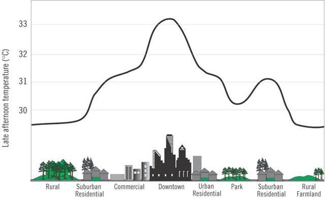
 Figure 2
. Schematic representation of a typical urban heat island. Taken from the
Urban Heat Islands website. Original source: EPA, 2008. Click on image to enlarge.
This phenomenon is known as the
“Urban Heat Island” effect (often abbreviated to “UHI effect”). The word
“island” is used because it is a localised effect which decreases as you leave the urbanized areas. This is schematically illustrated in Figure 2.
The exact amount of this extra urban warmth varies from town to town, from day to night, and from season to season. However, in general, the more urbanized the town is, the more warmth there tends to be.
Below is a 1 minute summary of the phenomenon by The Weather Channel:
Urban heat islands can cause serious problems for city dwellers during the summer, particularly in tropical and subtropical countries, e.g.,
India, since they increase the frequency and strength of heatwaves in the city. This is likely to become an even greater problem in the future as urban areas continue to expand and the number of people living in cities increases.
As a result, there is a lot of ongoing research into developing new construction techniques and urban planning schemes to try and reduce the rate at which these urban heat islands grow (
“urban heat island mitigation”), e.g., see Rizwan et al., 2008 (
Abstract;
Google Scholar access) for a review.
For instance, in the following 2 minute clip, two researchers from the
Heat Island Group at the Lawrence Berkeley National Laboratory (California, USA) discuss different types of materials which could be used for making pavements and car parks:
Aside from the problems urban heat islands can cause for city-dwellers, they also create an insidious problem for researchers who want to use weather station records to estimate global temperature trends.
This is because many of the world’s weather stations are
currently in urbanized areas, but in the late 19th/early 20th centuries, these areas were rural (or at least
less urbanized). As the areas around the weather stations became urbanized, this would have introduced an urban heat island at the station.
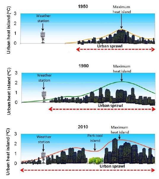
 Figure 3
. Schematic illustration of how an expanding urban heat island influences an urban station. Click to enlarge.
As the urbanization continued, the size of this heat island would have increased. This would have introduced an artificial warming trend into the weather station’s record, i.e., it would introduce an “urbanization bias”.
We illustrate this schematically in Figure 3. Let us consider a hypothetical weather station which has stayed in the same location since 1950, but has gradually become surrounded by urban sprawl. As the nearby city expanded over the decades, its urban heat island would have become bigger.
Initially, our hypothetical station might have been too far away to be affected (1950). However, as the urban sprawl expands, eventually the weather station begins to be affected by the expanding urban heat island (1950-1980). Soon, the weather station itself becomes urbanized (1980-2010).
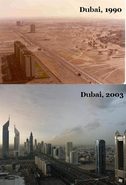
 Figure 4
. The same street in Dubai, United Arab Emirates in 1990 and 2003. Photos from
Farhad Abdolian’s blog. Click on image to enlarge.
Over the last century or so, urban areas have been dramatically growing across the world. Not only have previously rural areas been turned into urban areas (e.g., Figures 4), but smaller cities have grown into major urban metropolises (e.g., Figures 5).
At the moment, only about 1% of the world’s land surface is urbanized. So, this urbanization has probably not had much effect on actual global temperatures, e.g., Jacobsen & Ten Hoeve, 2012 (
Abstract;
Google Scholar access). However, as we will discuss in this essay, a surprisingly large number of the weather stations used for calculating global temperature trends are in these urbanized areas.
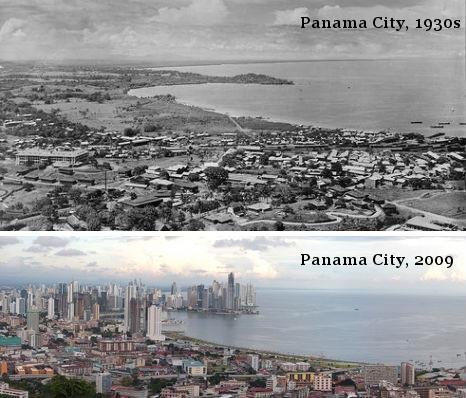
 Figure 5
. Panama City, Panama – 1930s and 2009. Photos via
Weburbanist.com. Click on image to enlarge.
This means that the
calculated global temperature trends are showing a lot more warming than the
actual global temperature trends.
In effect, urbanization bias has introduced an artificial “global warming” bias into the
calculated global temperature trends. This has nothing to do with our carbon footprint. Indeed, there are
some suggestions that urban areas actually have a lower carbon footprint than rural areas, e.g., Glaeser & Kahn, 2010 (
Abstract;
Google Scholar access), although the data is quite ambiguous, e.g., Heinonen & Junnila, 2011 (
Open access).
So, the people who have been blaming the recent
“unusual global warming” on man-made global warming from increased carbon dioxide concentrations could easily have been mistaken.
Urbanization bias in urban stations
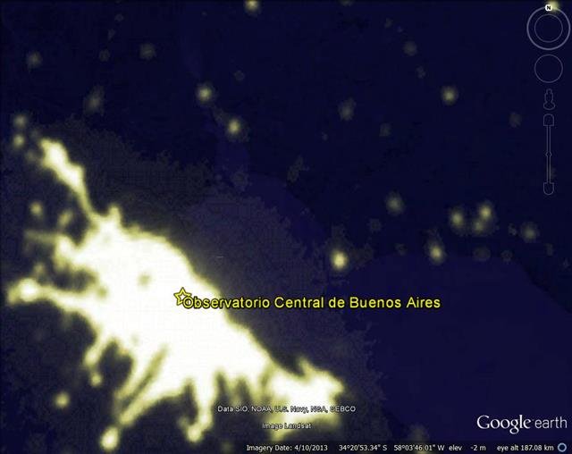
 Figure 6
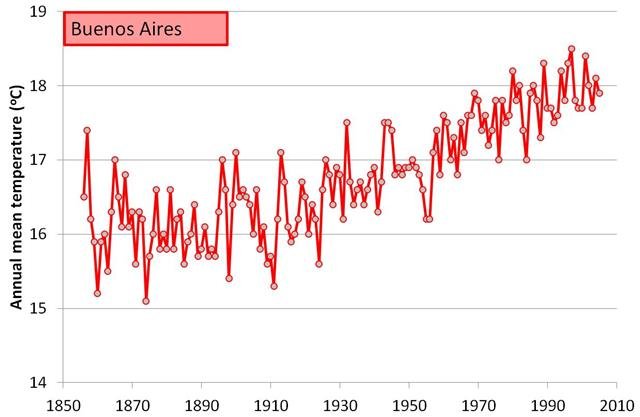
. Average annual temperatures recorded at the Buenos Aires weather station. Click on image to enlarge.
We can see from Figure 6, that the Buenos Aires station record implies that there has been a very strong warming trend since the early 20th century. The annual mean temperature was only 16°C at the start of the 20th century, but 18°C at the end. That’s an increase of about 2°C/century!
However, Buenos Aires (Argentina) is currently one of the most urbanized cities in the world. It underwent a rapid population growth over the 20th century, e.g., in 1914, the metropolitan area already had a population of 1.7 million, but by 2001 this had increased to 12.7 million! See
here. So, it is quite likely to have been affected by urbanization bias. Indeed, Figuerola & Mazzeo, 1998 (
Open access) have shown that Buenos Aires currently has a strong urban heat island, and presumably this was much smaller at the start of the 20th century.
Therefore, much of the strong “warming” trend implied by the Buenos Aires record is probably just urbanization bias. But, how much? Is it half of the trend? Is it all of the trend?
It’s actually really tricky to know for certain, because we don’t know exactly how the urban heat island at the station has developed over the century. We know it was there in 1998, because of Figuerola & Mazzeo, 1998’s study. But, when did it start affecting the station? Was there already an urban heat island at the station when it was set up in the 19th century, or did it only start developing in the 20th century?
What we can say for certain is that including the Buenos Aires record in the global temperature estimates will introduce at least some urbanization bias into the temperature estimates for Argentina.
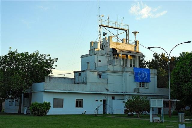
 Figure 7
. Photograph taken flying into Base Aeronaval Punta Indio. Via
Panoramio.com, by Martin Otero. Click on image to enlarge.
You’re probably wondering, “Why don’t we just look at those stations that are rural?”
The nearest rural station to the Buenos Aires station is Punta Indio (ID=30187596000). This station is located at the Base Aeronaval Punta Indio, which is in a rural part of Argentina (35°21’S, 57°18’W), 140km from the Buenos Aires weather station.
From looking at the location using Google Earth, this does seem to be a fairly rural location (Figure 7). The nearest town, Verónica is nearly 5km away, and is quite a small town (pop. 5,772 according to
Wikipedia).
 Figure 8
. Comparison of temperature trends of the rural, Punta Indio Base weather station to the Buenos Aires weather station. Click on image to enlarge.
So, this seems like a perfect station to compare to the Buenos Aires station, except for one problem… It only has 23 years of data (Figure 8), spread over a fairly short period, i.e., the 1950s-1990s.
While the Buenos Aires station record continued to show warming during those 23 years, the Punta Indio station record didn’t! This
suggests that the “warming” in the Buenos Aires record during those years was just urbanization bias.
Interestingly, the average temperature at the Punta Indio station was only about 16°C, i.e., the 19th century temperatures for Buenos Aires! Could that mean that
all of the warming trend in the Buenos Aires record was urbanization bias? Maybe… or maybe not… Maybe the Punta Indio station is just located in a much colder spot.
We really can’t say for sure, because the Punta Indio record is too short. The only stations in the area with relatively long records are urban.
 Figure 9
. The relative urbanization of stations with very short records (less than 30 years) or very long records (greater than 120 years). Click on image to enlarge.
This is one of the main challenges with the urban heat island problem – it is harder to keep enough staff to maintain a continuous temperature record at an isolated rural location for a century (or longer) than in the heart of a thriving metropolis.
This means that most of the available rural records are fairly short (a few decades), and most of the stations with records of a century or longer are in urban areas. We can see from Figure 9 that quite a large fraction of the stations with records with less than 30 years are rural (43%), but only 4% of the stations with more than 120 years are.
Most of the stations that are being used for calculating the
long-term temperature trends are urban!
Not just a problem for urban areas
 Figure 10
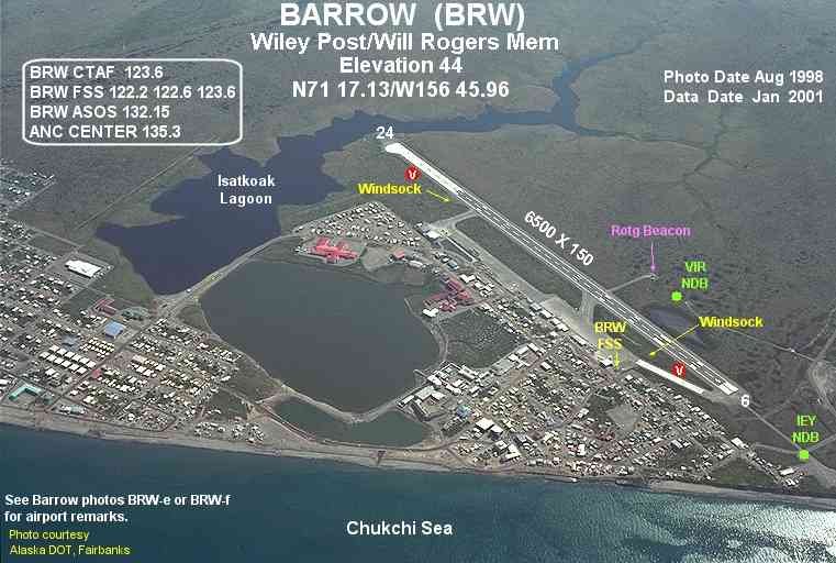
. Even small isolated towns in the Arctic, such as Barrow, Alaska (USA) have been affected by urbanization bias. Aerial photograph downloaded from
Wikimedia Commons. Click on image to enlarge.
Even in relatively isolated places, such as Barrow, Alaska (USA), urbanization bias is a problem. Barrow is at the northern tip of Alaska, high up in the Arctic. It is so isolated and far north that it was used as the setting for the 2007 vampire horror movie,
30 Days of Night. However, although the
NOAA ESRL Global Monitoring Division maintain a weather station that is located out in the open tundra, 7.5 km northeast from the town (at 71.3230°N, 156.6114°W), this weather station was only established in 1973.
For Barrow’s long term weather record, we have to instead rely on the National Weather Service (NWS) weather station which is located in the middle of the town. It was originally at the NWS office on 1018 Kiogak St. (at 71.3230°N, 156.6114°W), although it recently seems to have been moved to the nearby
Wiley Post-Will Rogers Memorial Airport.
This NWS weather record for Barrow has data stretching back to 1901, making it one of the longest weather records available for the Arctic. However, the village of Barrow has also expanded a bit since 1901. In 1900, it had a population of 300, but this had increased to 4,600 by 2000. While this might not seem like much compared to a major metropolis like Buenos Aires, the heavy energy usage of the residents during the bitter Arctic winter has been shown to cause a relatively strong urban heat island in the town.
Hinkel et al., 2003 (
Open access) have shown that during the winter, the town is on average 2.2°C warmer than out on the tundra. This urban heat island has benefits for the residents, e.g., it has led to a 9% reduction in the number of
freezing degree days and earlier snowmelt in the town. But, the development of the urban heat island would have also introduced a gradual warming bias into the NWS weather record.
 Figure 11
. Comparison between temperature trends for two of the longest weather station records for the Arctic. Click on image to enlarge.
In other words, urbanization bias is even a problem in the Arctic. Figure 11 compares the Barrow weather record to another Arctic station, Sodankylä, Finland.
[If you have read our essay on Arctic sea ice, you might recognise this figure from there].
Although Finland is on the European side of the Arctic, it is one of only six Arctic stations with data for more than 75 of the last 80 years,
and it is the only one of those six stations that is not associated with some form of urbanization.
Both stations show:
- Warming in the early 20th century, up to the 1930s
- Cooling from the 1930s to the 1970s
- Warming from the 1970s to the 2000s
However, in the rural Sodankylä record, the recent 1970s-2000s warming is much less pronounced than in the Barrow record, and it was just as warm in the 1930s as it is today. This suggests that urbanization bias in the Barrow record has made the 1970s-2000s warming seem much more unusual than it actually was.
The effects of urbanization bias on global temperature estimates
One rare region which has a large number of rural stations with relatively long and complete records is the U.S.
In 1890, the U.S. National Weather Service created a
Cooperative Observer Program (COOP) which encouraged volunteer weather enthusiasts to keep weather records at stations (rural and urban) across all of the United States. By using the data from this program, the National Climatic Data Center were able to create a high density dataset containing a large number of fairly long and complete records from all across the “contiguous United States” (i.e., all the states except Hawaii and Alaska). This dataset is called the
U.S. Historical Climatology Network (USHCN) and contains a large number of rural records with a century or more of data.
We discuss this U.S. dataset in more detail in Paper 3. However, for now, it is sufficient to note that almost all of the station records in this dataset are fairly long and complete (urban
and rural). Also, there are several rural and urban stations located in each of the U.S. states.
 Figure 12
. Average temperature trends for continental U.S. according to rural stations (top) and urban stations (bottom). Click on image to enlarge.
Of the 1218 stations in the U.S. Historical Climatology Network, about 23% of them are very rural and about 9% of them are highly urbanized. This gives us a relatively large set of stations which are similar enough that we can compare the temperature trends of rural and urban stations.
Figure 12 compares the average U.S. temperature trends when calculated using just the most rural stations to the trends calculated using the most urban stations.
Like the two Arctic stations in Figure 11, both subsets show similar trends:
- Warming from the 1890s up to the 1930s
- Cooling from the 1930s to the 1970s
- Warming from the 1970s to the 2000s
However, again, the urban stations also show an underlying warming trend, which substantially changes the context of the trends.
For the rural subset, the cooling periods are of roughly the same magnitude as the warming periods. In other words, they imply an almost cyclical “warming/cooling” pattern. The recent warm period doesn’t seem at all unusual. If anything, it seems to have been warmer in the 1930s! Indeed, the 1930s was a period of severe drought for the U.S., known as the
“Dust Bowl era”.
For the urban subset, there was less cooling during the 1930s-1970s cooling period…
and more warming during the 1970s-2000s warming period. This makes the recent warm period seem much hotter than the earlier warm period. Indeed, in early 2013, there were a number of claims that 2012 was the
“hottest year on record for continental U.S.” (
National Geographic).
The plots in Figure 12 are slightly smoothed
(using 11-point binomial smoothing) to highlight the differences between the two subsets, but if you’re interested, the non-smoothed plots can be seen in Figure 8 of Paper 3.We used the unadjusted version of the USHCN dataset for generating these plots. The National Climatic Data Center also provide versions which have been adjusted (“homogenized”) in an attempt to account for various non-climatic biases. We will briefly discuss some of these adjustments in Section 6, but for a detailed discussion, we recommend you read Paper 3.
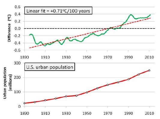
 Figure 13
. Estimate of the average urbanization bias in the urban U.S. stations (top) compared to the total urban population in the U.S. Click on image to enlarge.
Figure 13 shows the difference between the two subsets. We can see that the temperature trends for the two subsets have been steadily diverging at a rate of about 0.7°C/century. This divergence seems to correlate fairly well with the urban population growth for the U.S. (bottom panel). This suggests that the divergence is mostly due to urbanization bias.
It seems that urbanization bias has introduced a regional warming of about 0.7°C/century into the urban stations of the U.S. Historical Climatology Network. To put this in context, the
“unusual global warming” implied by the
global temperature trends in Figure 1 has been about 0.8°C/century.