6. Paper 3. How heavily urbanized are the stations used in the global temperature estimates?
Summary of Paper 3In Paper 3, we carried out a detailed assessment of the extent of urbanization bias in the Historical Climatology Network datasets. These are the main weather station archives used for the current global temperature trend estimates.
We found that the U.S. components included a relatively high number of rural stations with long records, making them somewhat reliable. However, we found that urbanization bias is still a problem for the dataset, and the subset of U.S. stations that were urban showed an average urbanization bias of about 0.7°C/century.
In the rural subset of U.S. stations, the recent warm temperatures aren’t actually that unusual, and it seems that it was
at least as warm in the 1930s.
As for the rest of the world, almost all of the rural stations in the dataset have records which are too short and/or are missing large periods of data.
Only eight of the rural stations have data for at least 95 of the last 100 years! This is
simply not good enough for estimating “global temperature trends”.
The National Climatic Data Center who compile and maintain the Historical Climatology Network datasets have developed a series of “homogenization” adjustments, which they believe remove any non-climatic biases from the data.
They have claimed that these adjustments have substantially reduced the urbanization bias problem. We show that this claim is wrong. Their homogenization algorithm is woefully inappropriate. Instead of removing urbanization biases, it merely
spreads the biases amongst all stations – urban and rural!
In Paper 3, we attempted to estimate how badly affected by urbanization bias the data is. To do this, we studied the main weather station dataset used by the five different groups, i.e., the Historical Climatology Network datasets.
A. How widely used are the Historical Climatology Network datasets?
NOAA’s National Climatic Data Center compile and maintain the main weather station datasets used by the five groups currently publishing global temperature trend estimates, i.e., the ones we mentioned at the start of the essay in Figure 1. The main dataset is known as the
Global Historical Climatology Network (GHCN), but a large component of this dataset is also available as a separate dataset called the
U.S. Historical Climatology Network (USHCN). Collectively, we refer to these datasets as the Historical Climatology Network.
Some of the groups rely almost exclusively on the Historical Climatology Network:
- The National Climatic Data Center uses it for all 7280 of their station records.
- NASA’s Goddard Institute for Space Studies uses it for 6280 out of their 6322 stations, i.e., 99.3%.
- The Japan Meteorological Agency uses it for 3883 out of their 3900 stations, i.e., 99.6%.
At first glance, it appears that the other two groups (Climate Research Unit and Berkeley Earth) are using fairly independent datasets. The Climate Research Unit only directly obtains less than one third of its station records from the Historical Climatology Network (1617 out of 5583), and the Berkeley Earth group gets less than one fifth of its records from them (7280 out of 39028).
However, a closer inspection of these other datasets reveals that they actually overlap very heavily with the Historical Climatology Network datasets.
The Climate Research Unit was one of the first groups to construct a weather station record dataset in the 1980s, e.g., see Jones et al., 1986 (
Open access). So, when the Global Historical Climatology Network was first released in the 1990s, the Climate Research Unit only started using it for the station records they didn’t have.
But, when the National Climatic Data Center were constructing the Global Historical Climatology Network, they were mostly using the same data sources that the Climate Research Unit had used – see Peterson & Vose, 1997 (
Open access). In fact, one of their main data sources was the Climate Research Unit’s datasets!
For this reason, it has been estimated that more than 98% of the station data used by the Climate Research Unit either comes from the Historical Climatology Network, or else is derived from one of the data sources used for constructing the Historical Climatology Network, e.g., see McKitrick, 2010 (
Open access).
The Berkeley Earth group use the Global Historical Climatology Network dataset, but they have combined it with several other datasets to create a much larger dataset than any of the others. The Berkeley Earth dataset contains records for nearly 40,000 stations, i.e., more than 5 times the number of stations in the Global Historical Climatology Network.
However, more than half of these stations in the Berkeley Earth dataset have very short records (less than 30 years of data). So, when the Berkeley Earth group are using their dataset for studing long-term trends, they are predominantly relying on the Global Historical Climatology Network component of their dataset.
Indeed, in one of the Berkeley Earth groups main studies, they just used the Global Historical Climatology Network, i.e., Rohde et al., 2013 (
Open access).
In other words, all of the groups rely very heavily on the Historical Climatology Network datasets. This means that to assess the extent of urbanization bias in each of the groups’ estimates, we can safely limit our analysis to the Historical Climatology Network…
B. How badly affected by urbanization bias are the datasets?
The U.S. component
As we mentioned in Section 2, when the National Climatic Data Center were constructing the U.S. Historical Climatology Network, they were able to take advantage of a very large collection of U.S. station records from the
Cooperative Observer Program (COOP) dataset. Many of these stations were rural, and so they were able to construct a relatively rural dataset, with relatively long and complete station records – see Karl et al., 1988 (
Open access).
In total, the U.S. Historical Climatology Network contains 1218 station records. The average length of the station records is 93 years, which is relatively long, and more than a fifth of them (277) are still rural today. In addition, only 99 of the stations are highly urbanized (in terms of population and average night-light intensity).
So, the U.S. component of the Historical Climatology Network is reasonably rural. Having said that, we saw in Section 2 (Figures 12 & 13) that the highly urbanized stations are significantly affected by urbanization bias, with the bias introducing a warming bias of roughly 0.7°C/century.
Some of that bias seemed to be due to different ratios in the various observation practices made at different stations, because, when we applied adjustments to correct for changes in “Time of Observation”, the difference between the urban and rural stations was reduced by about 0.2°C/century.However, as we discussed in our
“Has poor station quality biased U.S. temperature trend estimates?” paper (summarised
here), the Time of Observation adjustments also seem to make the poor station exposure biases more pronounced, i.e., the total amount of non-climatic biases is about the same.
The rest of the dataset
Unfortunately, the rest of the Global Historical Climatology Network is nowhere near as useful.
It is true that nearly one third of the stations in the dataset are still rural (1987 out of the 6051 non-U.S. stations). However, almost all of these rural stations have very short records. Most of the station records only have data in the 1950-1990 period, which as we discussed in Section 3, is not long enough to study long-term temperature trends.
Only
eight of the rural stations actually have data for at least 95 out of the last 100 years:
- The Pas, Manitoba (Canada)
- Angmagssalik (Greenland)
- Lord Howe Island (New Zealand)
- Sodankylä (Finland)
- Hohenpeißenberg (Germany)
- Valentia Observatory (Ireland)
- Sulina (Romania)
- Säntis (Switzerland)
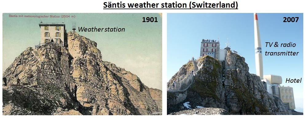
The Säntis weather station was set up in 1882, and has been in operation almost continously since then. Because it is located at the top of a tall mountain in the Swiss Alps (i.e., Mount Säntis), when it was first set up, it was quite difficult to get to. There was no cable car at the time, and especially during the winter, the weather station observers would have to stay up there for months on their own. Despite that, it was quite a lot of competition for the job, as it was well paid. Plus, the views are spectacular!
So, there was no shortage of candidates for the position. Indeed, in 1922, Gregor Kreuzpointner, a failed candidate for the job climbed up to the station and murdered the station observer and his wife who had the job (Josef & Maria Haas). The murders were discovered a few days later when people wondered why the weather reports had stopped. See
here for a description (in German).
 Figure 26
. Photographs of the Säntis weather station in 1901 (via
Jens Heling) and 2007 (via the
About Switzerland website). Click on image to enlarge.
It is still definitely a rural location, and so is unlikely to be affected by urbanization bias.
However, it is important to remember that does
not meant that it is unaffected by other non-climatic biases. There have been a lot of changes associated with the station.
For instance, in 1955, a 123.5m high
TV and radio transmitter was built beside it, and it is now the location of a
large hotel (Figure 26), that is a popular
tourist destination, e.g., CZ Tan has some nice photographs of her visit there on
her blog. In addition, the Swiss meteorological agency replaced the instruments used for weather measurements in the late 1970s to automated instruments, so that manual observations were no longer needed – see Begert et al., 2005 (
Open access).
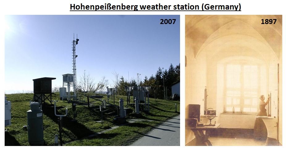
 Figure 27
. Photographs of the Hohenpeißenberg weather station in 1897 and 2007. Downloaded from the
German Wikipedia article about the station. Click on image to enlarge.
Similarly, there have been quite a few changes at the Hohenpeißenberg (Germany) station, since it first was set up in 1781. For instance, in the 18th and 19th centuries, temperatures were measured indoors, while now they are measured outdoors (Figure 27).
By using Google Earth, we were able to locate the current location for the Sulina weather station – on a concrete platform a few metres from the River Danube (Figure 28). However, the weather station has been relocated several times over the course of its record. For example, during World War 2, it was moved 140 kilometres south to the town of Constanta. Also, the official co-ordinates for the station are for a different spot, near the town centre, 5 kilometres to the west of its current spot. This suggests that the Sulina station has only recently moved to its current location.
 Figure 28
. Current location of weather station for Sulina (Romania). Photograph by Ion Bezergheanu, downloaded from
source). Click on image to enlarge.
It is possible that
any of these changes (or others) could have altered the local microclimate at these stations (a problem we discuss in
this essay), or introduced some instrumental biases.
If there are non-urban-related biases in these records, then we cannot
solely rely on them for working out what the long-term global temperature trends are.
Of course, this is a problem for
all weather records. It has been estimated that station changes which could potentially introduce a non-climatic bias occur on average about once every 20 years, e.g., Karl & Williams, 1987 (
Open access). However, the problem is that there are so few rural stations with long records that the only neighbouring stations that you can compare their records with are either potentially affected by urbanization bias, or else don’t have enough data!
Outside of the U.S., there are only
EIGHT station records in the Historical Climatology Network that are fully rural, and have data for at least 95 of the last 100 years. This is
not enough for working out long-term “global” temperature trends!
This is an insidious problem. Frankly, we do not believe it is possible to extract a meaningful estimate for the 20th century “global” temperature trends from the data
that is currently available.
There does seem to be enough rural stations with long records to be reasonably confident about the U.S. temperature trends for the 20th century, but not for the rest of the world.
Having said that, we think it
should be possible to collect a
lot more data which could allow some sort of reasonable analysis.
For instance, when the National Climatic Data Center were compiling the Global Historical Climatology Network, they were doing this effectively from the office, e.g., see Peterson & Vose, 1997 (
Open access). They don’t seem to have actually visited any of the stations, or tried to find out any “station history” information about the stations. Many meteorological organisations keep quite detailed station history files, and keep track of any reported station relocations, modifications to the surroundings or changes in instrumentation or measuring techniques.
If these history files were publically archived and the stations were individually inspected then maybe we would be able to identify some of the more serious non-climatic biases. It might also be possible to find longer and more complete records for some of the other rural stations.
Then, it might be possible to make some meaningful estimates of long-term global temperature trends from the weather records. However, until then, it is foolish to attempt it.
C. Does NOAA’s homogenization remove the problem?
Like NASA Goddard Institute for Space Studies, the National Climatic Data Center have also written a computer program which they believe removes non-climatic biases from their weather station dataset. This program is described by Menne & Williams, 2009 (
Open access) and adjusts each of the weather station records in their dataset so that it better matches those of its neighbours.
This process is called
“homogenization”, because after adjustment, all of the stations show pretty much the same trends, in the same way that
homogenized milk has a uniform texture throughout the milk.
The National Climatic Data Center have run this computer program on their Historical Climatology Network datasets, and provide the users of their data the choice to use the original datasets or their homogenized versions.
Many people believe that the homogenization process is somehow able to remove the urbanization biases from the data, and that they don’t need to worry about urbanization bias as long as they use the homogenized versions of the datasets, e.g., Menne et al., 2009 (
Open access).
For this reason, in Paper 3, we also checked to see if this belief was valid, i.e., does NOAA’s homogenization remove the problem?
The answer is no.
Essentially, all their homogenization program does is to spread the non-climatic biases evenly amongst the different stations, whether the stations were originally biased or not.
It is the same problem we discussed in our essay on
the problem of poor station quality in the U.S. dataset.
Before homogenization, many of the urban stations are affected by urbanization bias, but the rural stations aren’t.
The homogenization process adjusts all of the records so that each record better matches its neighbours. If an urban station is much more affected by urbanization than its neighbours, then this process will reduce the bias to better match the neighbours… So far, so good.
However, what happens if a rural weather station is surrounded by urban stations? The rural station is not biased by urbanization, but all of its neighbours are. Therefore, NOAA’s computer program introduces biases into the rural station’s record so that it “better matches its neighbours”. That’s
not good!
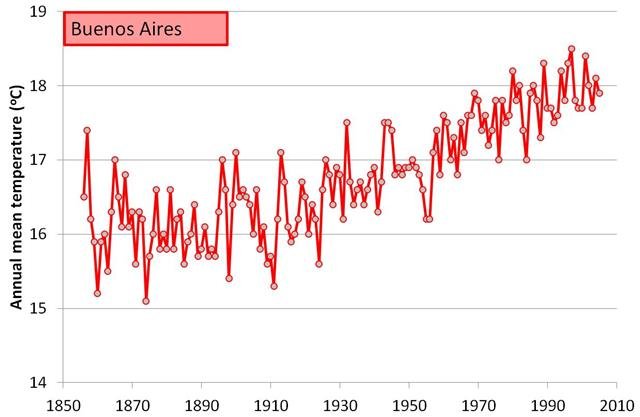
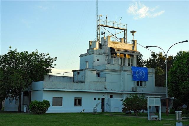
 Figure 29
. Photograph of the Buenos Aires weather station. Via
Panoramio, by geir-ole. Click on image to enlarge.
Sadly, as we saw throughout this essay, the rural stations are in the minority, particularly amongst stations with relatively long records. So, NOAA’s computer program introduces urbanization bias into the rural records more often than it removes it from the urban records.
We discuss the flaws with NOAA’s computer program in more detail in Paper 3, but we can illustrate the consequences simply by looking at the homogenization adjustments the computer program works out for two example stations:
- A weather station which we know is highly affected by urbanization bias, the Buenos Aires station we discussed in Section 2
- A weather station which is not affected by urbanization bias, the rural Valentia Observatory station which we discussed in Section 4
 Figure 30
. Google Earth aerial photograph showing the location of the Buenos Aires weather station. Click on image to enlarge.
Figure 30 shows the Buenos Aires weather station at Observatorio Central de Buenos Aires. This is the station whose record we discussed earlier (in Section 2).
The station is located in
Agronomía, which is a district right in the centre of Buenos Aires, Argentina.
Although the station itself is located in a park (34°35’24″S, 58°29’01″W), the park is in a very heavily populated area
(population density = 6,600/km2), and the station is only 85m from the edge of the park (Figure 32).
 Figure 31
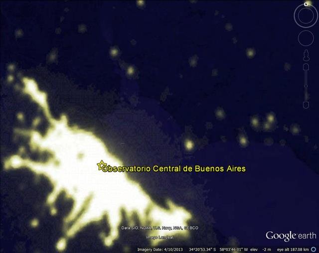
. Google Earth aerial photograph showing the location of the Buenos Aires weather station, using NASA Earth City Lights overlay. Click on image to enlarge.
Indeed, if we use NASA’s satellite measurements of the average night-time city lights as an estimate of the amount of urbanization in the area, then we can see from Figure 31 that the station is right in the middle of a
very heavily urbanized area.
Now, if NOAA’s computer program is indeed able to remove the non-climatic biases from the station records, it surely must remove a substantial warming trend from the Buenos Aires record to get rid of the urbanization bias. Right?
So, what adjustments does it calculate for Buenos Aires?
 Figure 32
. The ‘homogenization’ adjustments applied by the National Climatic Data Center to the Buenos Aires station record. The bottom panel indicates the neighbouring stations they used for calculating these adjustments. Click on image to enlarge.
Figure 32 shows the adjustments that NOAA’s homogenization program applies to the Buenos Aires record. Nothing!
As we discussed in Section 2, we
know that the Buenos Aires record is affected by urbanization bias. Figuerola & Mazzeo, 1998 (
Open access) even went out and measured the urban heat island in Buenos Aires. But, NOAA’s computer program did nothing about it!
Why?
Well, if you look at the bottom panels of Figure 32, you can see that most of the neighbours the program used are urban stations, i.e., the neighbours are
also affected by urbanization bias. The few rural neighbours that are around only have fairly short records (remember the Punta Indio station from Section 2?).
 Figure 33
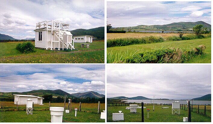
. Photographs of the Valentia Observatory, Ireland weather station. 51.938°N, 10.248°W. Via
Global Atmosphere Watch, World Meteorological Organization. Click on image to enlarge.
What about our second example station, Valentia Observatory?
As can be seen from Figures 33 and 34, the
Valentia Observatory weather station in Co. Kerry, Ireland is very rural.
There is a nearby town,
Cahirsiveen, but the station is about 0.5km outside of the town, and the town is relatively small (pop. 1,294 in 2006). In other words, it is unlikely to be badly affected by urbanization bias.
Valentia Observatory also happens to be one of the longest and most complete rural station records in the dataset.
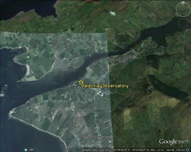
 Figure 34
. Google Earth aerial photograph showing the location of the Valentia Observatory, Ireland weather station. 51.938°N, 10.248°W. Click on image to enlarge.
As we mentioned earlier, Valentia Observatory is one of only eight rural stations with data for at least 95 of the last 100 years (
aside from the U.S. dataset, that is).
In other words, it is one of our only rural station records that we can use for studying long-term temperature trends.
So, what does NOAA’s computer program reckon should be done to it?
Figure 35 shows the adjustments NOAA’s program applies to the Valentia Observatory record.
Unlike the Buenos Aires record, which it reckoned was perfect as it was, it decides that it needs to
introduce a warming trend of roughly 0.4°C/century into the Valentia Observatory record.
 Figure 35
. The ‘homogenization’ adjustments applied by the National Climatic Data Center to the Valentia Observatory station record. The bottom panel indicates the neighbouring stations they used for calculating these adjustments. Click on image to enlarge.
Did the program figure this out by comparing it to rural stations?
No, because there are no nearby rural stations that would have a long enough record to compare it to.
Instead, the program introduces the warming so that the Valentia Observatory record better matches the records of its
urban neighbours!
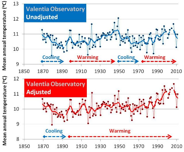
Figure 36 shows the effect of these adjustments. Before homogenization (top panel), the Valentia Observatory record varies between periods of cooling and periods of warming.
As we discussed in Section 4, for the Valentia Observatory record, the recent 1980s-2000s warming doesn’t seem particularly unusual, and the hottest year on record occurred in 1949.
 Figure 36
. The Valentia Observatory station record before and after the National Climatic Data Center’s ‘homogenization’ adjustments. Click on image to enlarge.
However,
after homogenization (bottom panel), most of the cooling periods have been eradicated, and the record shows an almost continuous warming trend since the end of the 19th century.
As a result, it makes the last decade or so seem “unusually warm”. In other words, it looks pretty much like the “global temperature trends” we saw at the start of the essay in Figure 1.
Essentially, NOAA’s computer program leaves urbanization bias in the urban stations and
adds extra warming into those rare rural stations which didn’t have urbanization bias beforehand.
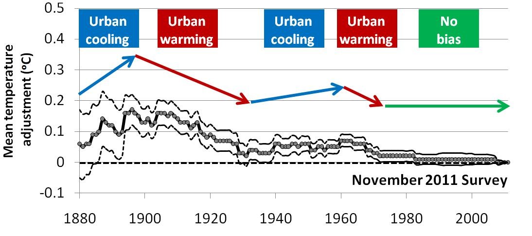
Summary: "Urbanization bias" Papers 1-3
.