• NEW! LOWEST RATES EVER -- SUPPORT THE SHOW AND ENJOY THE VERY BEST PREMIUM PARACAST EXPERIENCE! Welcome to The Paracast+, eight years young! For a low subscription fee, you can download the ad-free version of The Paracast and the exclusive, member-only, After The Paracast bonus podcast, featuring color commentary, exclusive interviews, the continuation of interviews that began on the main episode of The Paracast. We also offer lifetime memberships! Flash! Take advantage of our lowest rates ever! Act now! It's easier than ever to susbcribe! You can sign up right here!

    Subscribe to The Paracast Newsletter!

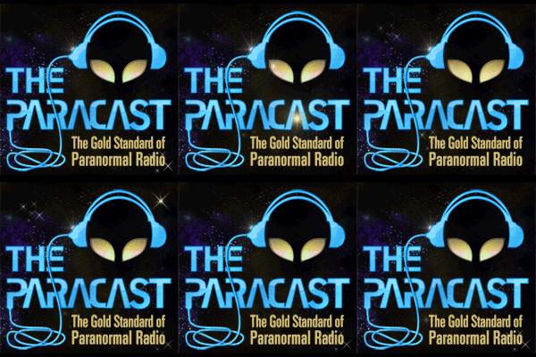
The Paracast — A New Look?

Free episodes:

I liked the previous logo, but it was a total failure when it came to selling T-shirts and other logo merchandise.

For now, let's see how this one works when it comes to our new store (The Official Paracast Store {Beta}).

As to whether it serves as a permanent logo — rather than just a special "look" to push the brand — I wouldn't say right now.

But if we can get a logo that works for the show and for merchandising, I'm wiling to throw in a lifetime membership in Paracast+ for the artist who can manage it.

Let's see what our talented listeners can deliver.

Why not use the real Soccoro symbol (with Ray's permission) or some derivative of it?
 
Once I see a selection of candidates, I can take it to a vote. Obviously, if we see lots of orders for RPJ's caricature, we'll keep selling the T-shirts either way. :)
 
It may work for a store; I just don't see it being a good choice for the show. But since I don't have any artistic talent to draw anything myself, I can only make suggestions.
 
I'm really glad we're having this discussion. Perhaps we should have two logos for different uses, and I welcome suggestions. Right now I'd like to see more proposals.

There have been a few others over the years, and I'll have to find the threads and move the messages soon to get this discussion moving.
 
It may work for a store; I just don't see it being a good choice for the show. But since I don't have any artistic talent to draw anything myself, I can only make suggestions.
Exactly. Keep it for a merch option, nothing wrong with that, though I'd be shocked if it was that popular, but as a front-line brand representation it's not the right imaging. I know a few talented graphic designers but unfortunately they are not into the paranormal and wouldn't see the cool-factor of donating their expensive services for a new logo.
 
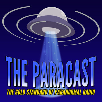
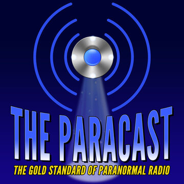
You may remember I put some designs together a while back. I think Gene was looking for further feedback. Just a reminder here they are. Any changes can easily be implemented

PARACASTLOGO2.jpg PARACASTLOGO1a.jpg PARACASTLOGO4.jpg
Quick feedback on the 3 images. I like the show name font/design of the first graphic, with the ship and beam design of the second design. I would lose the space background for the t-shirt, as the ship and text would "pop" better on a shirt, or other types of merch.
 
Quick feedback on the 3 images. I like the show name font/design of the first graphic, with the ship and beam design of the second design. I would lose the space background for the t-shirt, as the ship and text would "pop" better on a shirt, or other types of merch.

I agree with that. I designed them with the Thumbnail avatar in mind. Yes the would need amended for T-shirt/merchandise - thanks for your input buddy
 
Thanks, @Spectre73.

It may end up that there are different logos for different uses. The caricature at GCN, and something that's also fun for the T-shirts and other merchandise, since that's what'll help sales.

Once I see some more contenders, I'll post a poll and put it up for a vote.

The winner, the artist who delivers a logo we will use, will get a lifetime Paracast+ subscription.
 
I am SO EXCITED I'm getting a t AND a hoodie with the RPJ graphic.
I feel the toon is a great representation of the fun atmosphere of the show and makes a great addition to whatever more serious logo.
 
Thank you for making the point about the merchandising. It has to be fun, and just a show logo isn't exactly fun.

Keep the suggestions coming.
 
My contributions!
2 versions with "the" variations:
S35djbP.png
zjpFFOA.png
jvnCprZ.png
CA1FMGb.png
 
Creepy Green, nice to see you back. Looking forward to seeing Goggs return. Does anyone know why it’s been quite a while since Burnt State last posted?
 
Back
Top