3. How was this “extremely likely that…” conclusion reached?
Since the IPCC reports are very long and tedious documents, many people rely exclusively on the Summary for Policymakers to accurately summarise the key points discussed of the report. Even climate scientists who might read the chapter(s) relevant to their specialty, will often rely on the Summary for Policymakers to summarise the rest of the report. In addition, the IPCC press releases and all of the media coverage of the Assessment Reports are based almost entirely on the Summary for Policymakers.
As a result, when you hear people referring to the “scientific consensus” on global warming, they are usually referring to the contents of the Summary for Policymakers. Ironically, as we discussed in the previous section, this is the one part of the report which is
not subjected to scientific review by the Expert Reviewers. So, the Summary for Policymakers is probably amongst the least scientific parts of the IPCC reports.
In any case, when the 5th Assessment Report of Working Group 1 was published in September 2013, much of the media attention focused on one particular section in the Summary for Policymakers which claimed that it was
“extremely likely” that human activity was responsible for most of the global warming since the 1950s. In the 4th Assessment Report (2007), a similar claim had been made, except that at the time, they had made the slightly lesser claim that it was
“very likely”. According to the IPCC terminology, “extremely likely” means more than 95% certain, while “very likely” means more than 90% certain. In other words, the IPCC was not only claiming that most of the global warming since the 1950s was man-made – they were implying that the evidence for this claim was even stronger than it had been in 2007.
Not surprisingly, this claim, captured a lot of attention from journalists and bloggers, e.g.,
here,
here,
here,
here,
here and
here.
With this in mind, in this section, we will:
- Try to figure out the basis for this claim
- Assess if it is a justified claim
- See if it genuinely represents the scientific consensus
First, let us look in detail at the relevant section in the Summary for Policymakers (“SPM”):
Human influence has been detected in warming of the atmosphere and the ocean, in changes in the global water cycle, in reductions in snow and ice, in global mean sea level rise, and in changes in some climate extremes (Figure SPM.6 and Table SPM.1). This evidence for human influence has grown since AR4. It is
extremely likely that human influence has been the dominant cause of the observed warming since the mid-20th century. {10.3–10.6, 10.9}
- Section D.3 of the Summary for Policymakers
The numbers in curly brackets
“{10.3-10.6, 10.9}” refer to the sections in the IPCC report on which this claim was based, i.e., the claim is based on Sections 10.3-10.6 and 10.9 of Chapter 10. The title of Chapter 10 is “Detection and Attribution of Climate Change: from Global to Regional”.
Indeed, in the Executive Summary for Chapter 10, one of the claims made is
“It is extremely likely that human activities caused more than half of the observed increase in global mean surface temperature from 1951-2010.” This is pretty similar to the Summary for Policymakers claim, so it seems likely that the claim was originally made by the Chapter 10 authors.
Interestingly, 17 of the 73 Chapter 10 authors were also draft authors for the Summary for Policymakers. Since there were only 71 draft authors for the Summary for Policymakers, that means that nearly 1/4 of the Summary for Policymakers draft authors (23.9%) were involved in writing Chapter 10. This is quite a large number of authors. So, it seems the contents of Chapter 10 were actually quite influential in drafting the entire Summary for Policymakers.
With that in mind, let us consider what Chapter 10 was reporting. As you might have guessed from its title, there were two aims for Chapter 10:
- The detection of statistically significant changes in climate.
- Attributing those climate changes to different factors.
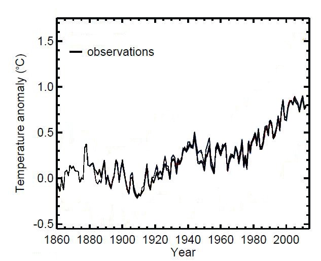
 Figure 4
. The global temperature estimates used for the
IPCC WG1 5th Assessment Report. Adapted from their Figure 10.1. Click on image to enlarge.
As you probably know at this stage, the global temperature estimates used by the IPCC suggest that there was a general “global warming” trend over the 20th century. The IPCC global temperature estimates are shown in Figure 4.
However, “detecting” that there has been global warming does
not actually tell us what caused the global warming. For instance, maybe it was
man-made global warming, or maybe it was
natural global warming. Or maybe it was a mixture of both…
This brings us to the other role of the Chapter 10 authors, i.e., “attribution”. They assumed that man-made global warming was real, but recognised that natural global warming could also occur. They wanted to pinpoint at what stage in the 20th century most of the global warming was man-made, as opposed to natural.
All of the current climate models explicitly assume that man-made global warming theory is valid, and that increasing atmospheric CO2 causes global warming. So, one way in which the climate models can simulate “global warming” is by increasing CO2 concentrations.
This means that, in the climate models, global warming is defined as being “man-made” if it is caused by increasing CO2 concentrations.
The current IPCC climate models only include
one possible mechanism for natural global warming – changes in solar variability. However, deciding how solar variability has changed since the mid-19th century is tricky, because there are actually quite a lot of different “solar reconstruction” datasets.
Some solar reconstructions suggest that solar activity has been increasing since the 19th century. Others suggest that it increased in the beginning of the 20th century, but then decreased. Yet others suggest that there has been almost no change. See Scafetta, 2011 (
Abstract, .pdf available from
Scafetta’s homepage) for a review.
When the IPCC climate modellers are carrying out their simulations, they pick one of these solar reconstruction datasets to use. However, so far, they have only used those reconstructions which (a) suggested an early 20th century increase followed by a decrease, or (b) suggested there has been almost no change in solar activity since the 19th century. Surprisingly,
none of the IPCC climate models used any of the datasets which suggested that solar activity has been increasing!
More worryingly, many of the models do not include
any solar variability! In other words, many of the models include
no mechanism for natural global warming. So, it seems that the ability of the climate models to simulate natural global warming is very limited.
Nonetheless, the Chapter 10 authors assume that:
- CO2 causes global warming, and the current climate models accurately describe this.
- The climate models are able to accurately simulate natural climate variability.
- Their global temperature estimates are reasonably accurate, and aren’t seriously biased by urban heat islands, or anything like that.
At this point, we should remind you that we completely disagree with
all three of these assumptions! Our “Physics of the Earth’s atmosphere” papers show that CO2 does not cause global warming,
and that the current climate models are seriously flawed (
summary here). Our “Urbanization Bias” papers show that the global temperature estimates used by the IPCC are strongly biased by urbanization, particularly since the mid-20th century (
summary here). But, having said that, the Chapter 10 authors wouldn’t have seen our papers when they were writing their report.
 Figure 5
. The climate model global temperature results from the 4th Assessment Report (CMIP3) and the 5th Assessment Report (CMIP5). The bottom panel results were generated by keeping pre-industrial CO2 concentrations. Adapted from Figure 10.1 of the
IPCC WG1 5th Assessment Report. Click on image to enlarge.
At any rate, by making these assumptions, they decided to take the following approach to answer their question of “when did global warming become mostly man-made?”
First, they took the global temperature results from one set of climate models which incorporated the known changes in CO2. These are shown in the top panel of Figure 5.
Each of the thin orange lines corresponds to the simulation results from one of the “CMIP5″ climate models. These were climate model simulations that were specifically carried out for the 5th Assessment Report. For comparison, each of the light blue lines corresponds to the simulation results from one of the “CMIP3″ climate models, which were carried out for the 4th Assessment Report. For more details, the CMIP website is
here.
Second, they took a second set of climate model simulations which were identical to the first set, except that CO2 concentrations were kept constant at 19th century levels. These simulation results are shown in the bottom panel of Figure 5.
The simulation results for both sets are fairly similar up to the mid-20th century. However, after then, the models in the top panel show very strong “global warming”, while the models in the bottom panel don’t.
This is not too surprising because (a) CO2 concentrations didn’t actually increase much until about the 1950s, and (b) the current climate models don’t include many mechanisms to account for natural global warming.
At any rate, as we saw earlier, the global temperature estimates that the IPCC use suggest that there was a general global warming over the entire 20th century. So, the Chapter 10 authors concluded that most of the global warming since about the 1950s was “man-made”.
Notice that the Chapter 10 authors were
not trying to prove or disprove man-made global warming theory
or checking the reliability of the climate models! They were
assuming that man-made global warming theory was valid, and that their models were reliable. Instead, they were merely checking at what stage global warming would become “mostly man-made”… if their models were accurate. This is important, because many people mistakenly assume that the authors of the detection/attribution chapters in the IPCC reports were actually testing man-made global warming theory and the climate models.
Note for simplicity, we haven’t mentioned other greenhouse gases and aerosols. In the climate models, increases in greenhouse gases such as methane, and CFCs, are assumed to also cause some global warming, while increases in aerosols are assumed to cause global cooling. In the CMIP simulations, aerosols can either be man-made (e.g., from industrial emissions) or natural (from volcanoes).
So, we now have an explanation for why the IPCC report concluded that
“…human influence has been the dominant cause of the observed warming since the mid-20th century.” But, this leads to another question. Where did the “more than 95% likely” and “extremely likely” bit come from? And why was it only “more than 90% likely” or “very likely” in the 4th Assessment Report? Surprisingly, the origin of these probabilities and likelihoods has
not actually been fully explained.
If the authors are definite that most of the global warming since the 1950s is man-made, then they should give a definite and conclusive statement. They either are certain or they aren’t.
Unfortunately, many of the results the IPCC authors describe in the report are actually ambiguous or inconclusive. So, if they are to be true scientists, they cannot make conclusive statements on the basis of those results. This creates a problem for the IPCC organisers.
The IPCC reports are supposed to advise governments on the scientific consensus on climate change. But, governments are rarely satisfied if a scientist says “here, I have some inconclusive results for you!” So, if the IPCC authors don’t make conclusive statements, the reports will not be of much interest to politicians.
After the first few reports, the IPCC decided that they needed a compromise. So, from the Third Assessment Report onwards, the IPCC decided that authors should only make definitive and conclusive-sounding statements,
but that they would accompany those statements with an estimate of how likely they felt it was that the statement was correct. That way, the scientists could say “I never said it was conclusive, I only said it was likely”, and the politicians could still say “scientists say so…”
Of course, where one person might say that something was “very likely”, another person might say it was “likely”, and another might say it was only “quite likely”. It’s a very subjective process. To make it less subjective, the IPCC decided to associate a list of specific likelihood terms with statistical probabilities. For instance, the famous “extremely likely” term in IPCC terminology means “more than 95% certain”.
As we will discuss later, assigning these terms is
still subjective, but it does mean that the authors can be somewhat consistent in how confident they are when they pick a “likelihood” for their statements.
In the table below, we list the IPCC “likelihood” terminology. For every statement the authors make, they are supposed to pick a “likelihood” from the following scale:
Scale Probability Description in words
1 Less than 1% chance Exceptionally unlikely
2 Less than 5% chance Extremely unlikely
3 Less than 10% chance Very unlikely
4 Less than 33% chance Unlikely
5 33%-66% chance About as likely as not
6 More than 50% chance More likely than not
7 More than 66% chance Likely
8 More than 90% chance Very likely
9 More than 95% chance Extremely likely
10 More than 99% chance Virtually certain
It seems that, on a scale of 1 to 10, when the Chapter 10 authors were asked the following question, “how likely do you think it is that most of the global warming since the 1950s is man-made?”, they went with a score of 9 (“extremely likely”). Their predecessors for the 4th Assessment Report went with a score of 8 (“very likely”) and the 3rd Assessment Report authors went with a score of 7 (“likely”).
The above rating scheme hadn’t been introduced for the earlier reports. But, for the 2nd Assessment Report, the authors claimed there was a
“discernable human influence on global climate”, which is similar to a score of 6 (“more likely than not”). Meanwhile in the 1st Assessment Report, the authors were unsure whether the reported global warming was due to human activity, or simply due to natural variability, i.e., they felt it was “about as likely as not” to be man-made global warming, which is roughly equivalent to a score of 5.
There seems to be a remarkable pattern:
Report Year Confidence score
1st Assessment Report 1990 5
2nd Assessment Report 1995 6
3rd Assessment Report 2001 7
4th Assessment Report 2007 8
5th Assessment Report 2013 9
It looks like
with each report the IPCC authors simply increase their confidence score by 1! If that’s all that they’re doing, does that mean that if there is a 6th Assessment Report, they will increase their confidence score to 10 (“virtually certain”)? If so, what will they do if there is a 7th Assessment Report? Will they add more scores to the scale so that they can increase their confidence
“up to eleven” or will they instead start decreasing their confidence?
At any rate, whether this stepwise increasing up the scale by one with each report is a coincidence or not, it is actually very surprising that they chose to increase their confidence
at all for the 5th Assessment Report.
For the 4th Assessment Report, their attribution studies only looked at the 20th century, specifically, 1900-1999. However, as we mentioned in the previous section, in the last 10-15 years, global temperatures seem to have “paused”, even though CO2 emissions have continued to rise.
This means that the attribution studies for the 4th Assessment Report stopped just at the time “the pause” was starting. As a result, the apparent match between the models and data was actually better for the 4th Assessment Report period, than it is now!
For this reason, a few months before the WG1 5th Assessment Report was published, IPCC author, Prof. Hans von Storch, voiced his concern that “the pause” suggested to him that the climate models are much
less reliable than had been assumed at the time of the 4th Assessment Report, and that the scientific community should be openly re-evaluating the models:
So far, no one has been able to provide a compelling answer to why climate change seems to be taking a break. We’re facing a puzzle. Recent CO2 emissions have actually risen even more steeply than we feared. As a result, according to most climate models, we should have seen temperatures rise by around 0.25 degrees Celsius (0.45 degrees Fahrenheit) over the past 10 years. That hasn’t happened. In fact, the increase over the last 15 years was just 0.06 degrees Celsius (0.11 degrees Fahrenheit) — a value very close to zero. This is a serious scientific problem that the Intergovernmental Panel on Climate Change (IPCC) will have to confront when it presents its next Assessment Report late next year.
- Prof. Hans von Storch, interview with der Spiegel, June 2013
Here is a recent interview with him for a Canadian news programme (July 2013)
[Note that von Storch has stressed that he was not involved in choosing the photographs that play in the background during the interview]:
[If the video above won’t play for you, try this link.]
Prof. Judith Curry (another IPCC author) also believes that the failure of the climate models to predict the “pause” in global warming indicates that the IPCC has substantially underestimated the role of natural variability in recent climate change, e.g., see
here,
here,
here or
here.
If the “pause” is causing climate scientists to question the reliability of the climate models, then this
should have led the IPCC authors to
reduce their confidence in their claim that most of the global warming since the 1950s was man-made. But, instead the Chapter 10 authors actually increased their confidence from 8 (“very likely”) to 9 (“extremely likely”)!
Most readers would probably assume that this was a well documented, scientifically determined decision, and that it arose from rigorous debate amongst the scientific community. However, remarkably, the decision was a confidential one made by the Chapter 10 (and perhaps Summary for Policymakers) authors, and we, along with the rest of the scientific community, do not actually know for certain exactly why they chose “more than 95% certain”.
Indeed, this was one of the criticisms of the IPCC made by a 2010 InterAcademy Council committee to review the IPCC process:
… it is unclear whose judgments are reflected in the ratings that appear in the Fourth Assessment Report or how the judgments were determined. How exactly a consensus was reached regarding subjective probability distributions needs to be documented.
- Committee to review the Intergovernmental Panel on Climate Change, InterAcademy Council, October 2010 – p39
As we mentioned earlier, the claim of “extremely likely” confidence was mentioned in both the Summary for Policymakers and Chapter 10. With this in mind, it seems likely that those 17 authors who were involved in the writing of
both Chapter 10 and the Summary for Policymakers to us were predominantly responsible for the decision.
So, we suspect that it was at least one of the following 17 IPCC authors who actually made the claim:
Author Chapter 10 role Summary for Policymakers role
Nathaniel L. Bindoff Co-ordinating Lead Author Drafting Author
Peter Stott Co-ordinating Lead Author Draft Contributing Author
Myles Allen Lead Author Draft Contributing Author
Nathan Gillett Lead Author Drafting Author
Gabriele Hegerl Lead Author Draft Contributing Author
Judith Perlwitz Lead Author Draft Contributing Author
Olivier Boucher Contributing Author Draft Contributing Author
Jonathan Gregory Contributing Author Drafting Author
Georg Kaser Contributing Author Draft Contributing Author
Reto Knutti Contributing Author Drafting Author
Valerie Masson-Delmotte Contributing Author Drafting Author
Gerald Meehl Contributing Author Drafting Author
Viviane Vasconcellos de Menezes Contributing Author Draft Contributing Author
Timothy Osborn Contributing Author Draft Contributing Author
Joeri Rogeli Contributing Author Draft Contributing Author
Drew Shindell Contributing Author Drafting Author
Peter Thorne Contributing Author Draft Contributing Author
Still, whoever ultimately made the decision, and whatever their reasons, we can definitely state that it does
not represent an actual consensus amongst the scientific community. For instance, as we mentioned above, Profs. von Storch and Curry have both independently said that the “pause” should have led to a decrease in confidence.
On her blog, Curry has summarised her own understanding of the origin of the “95%” figure. Curry has never been involved in the writing of the Summary for Policymakers. Nonetheless, she is an IPCC scientist, and contributed to one of the chapters in the 2001 Working Group 1 report. The following text (in italics) is taken from a blog post she wrote just after the WG1 5th Assessment Report Summary for Policymakers was published (see
here):
“Yesterday, a reporter asked me how the IPCC came up with the 95% number. Here is the exchange that I had with him:
Reporter: I’m hoping you can answer a question about the upcoming IPCC report. When the report states that scientists are “95 percent certain” that human activities are largely to cause for global warming, what does that mean? How is 95 percent calculated? What is the basis for it? And if the certainty rate has risen from 90 in 2007 to 95 percent now, does that mean that the likelihood of something is greater? Or that scientists are just more certain? And is there a difference?
JC: The 95% is basically expert judgment, it is a negotiated figure among the authors. The increase from 90-95% means that they are more certain. How they can justify this is beyond me.
Reporter: You mean they sit around and say, “How certain are you?” ”Oh, I feel about 95 percent certain. Michael over there at Penn State feels a little more certain. And Judy at Georgia Tech feels a little less. So, yeah, overall I’d say we’re about 95 percent certain.” Please tell me it’s more rigorous than that.
JC: Well I wasn’t in the room, but last report they said 90%, and perhaps they felt it was appropriate or politic that they show progress and up it to 95%.
Reporter: So it really is as subjective as that?
JC: As far as I know, this is what goes on. All this has never been documented.”
If even IPCC scientists like Prof. Curry don’t know how
or why the IPCC decided on this 95% claim, then it doesn’t seem like much of a “scientific consensus”. Yet, this seems to have been one of the most widely quoted claims of the IPCC report!

 Apocalypse in Ireland!